Early development of the SH training level
Posted: (160216)(17:02.28)
Finally some more map shots, this time of the psychedelic and disorientating training level in SH:-
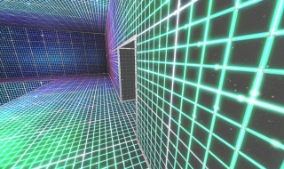
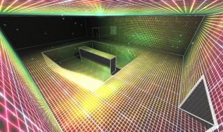
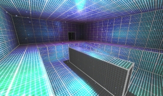
Hopefully we'll have a video up soon of this in action, especially now that we can 'offline render' anything from within the engine. This showcases a couple of interesting features, with the main material cycling colours in a couple of different interesting ways and at different rates, so the overall colour of the environment is constantly changing. It also changes colour depending on the distance/perspective of the surface, to really give it an iridescent appearance as you move around in the level, done by simply shifting the hues down through the mipmap stages. Finally, there is a separate layer underneath all surfaces that renders directly to the skybox, no matter if there is a lot of geometry (that should be) visible through the seamingly semitransparent material, everything appears as an opaque surface. Especially with the skybox animating (rotating) it makes this environment particularly disorientating. Combined with the particle effects both in the world and attached to the player viewpoint, this will be some hallucinatory-like experience when navigating these virtual training exercises, which was originally the whole point to the concept.


Hopefully we'll have a video up soon of this in action, especially now that we can 'offline render' anything from within the engine. This showcases a couple of interesting features, with the main material cycling colours in a couple of different interesting ways and at different rates, so the overall colour of the environment is constantly changing. It also changes colour depending on the distance/perspective of the surface, to really give it an iridescent appearance as you move around in the level, done by simply shifting the hues down through the mipmap stages. Finally, there is a separate layer underneath all surfaces that renders directly to the skybox, no matter if there is a lot of geometry (that should be) visible through the seamingly semitransparent material, everything appears as an opaque surface. Especially with the skybox animating (rotating) it makes this environment particularly disorientating. Combined with the particle effects both in the world and attached to the player viewpoint, this will be some hallucinatory-like experience when navigating these virtual training exercises, which was originally the whole point to the concept.